DEVLOG - JOURNAL MENU UI AND ART DESIGN

LET'S GOOO
Thanks for taking the time to check out this HIGHLY requested devlog for my dark fantasy and horror visual novel Catalyst: Blind Faith. Over the last 2 years I have implemented a complex menu system, styled like the player's journal, and I've been asked MANY questions about its design and implementation. Today we're going to take a deep dive into the history of the journal menu's design, its many art considerations, and what the final design contains!
But wait, you might be thinking, "ALARIC, DOES THIS MEAN YOU'LL WALK US THROUGH THE HUNDREDS OF SECTIONS THAT COMPRISE EVERY SUBMENU IN THE JOURNAL'S CODE?"
well
This journal is something designed explicitly with its own needs in mind at every step, and just for this game. Its elements could be done in many engines more easily than Ren'Py, but it was an informed decision on my part when choosing Ren'Py for the many other benefits this engine provides. I will not be breaking down any programming elements or performance considerations in this devlog, as even the broadest explanation of a single page would warrant an entire devlog in and of itself.
In the interest of time and providing both useful and insightful information, we'll be keeping the focus on the art, tone, and UI elements instead!
which is still a hell of a lot, so get comfy c:
This is going to be a LONG post. I've taken a trip down memory lane and unearthed my oldest concepts for this menu system, and am so excited to share how far it has come. This is a reflection not just of my growth as an artist, programmer, and game designer, but also a direct example of how working on these skills has helped me realize my original concepts in high quality!
It might be fun for you to compare the very first concept versus the last one. Kind of like seeing a picture come into focus. c:
Due to the length of this menu project--the journal has literally hundreds of small components, and we're going to wind the clock back several years in my work, even outside Catalyst: Blind Faith--I'm going to share assets and explanations chronologically. We'll circle back at the very end of the devlog to those final features, what's in the current build of the demo, and what I'm finishing integrating for the next demo build!
OK
HERE WE GOO
CATALYST: BLIND FAITH - JOURNAL MENU DEVELOPMENT TIMELINE
September 3rd, 2019 - Why the journal menu has been cooking in my brain for nearly 5 years
The original inspiration for Catalyst: Blind Faith is a specific kind of interactive fiction series, which was named "Catalyst Quest." Catalyst Quest is not a visual novel. It is not the same universe as Catalyst: Blind Faith. They are separate projects, but it's important!
Catalyst Quest is also a little different from more common, pre-written interactive fiction. Instead of publishing a complete story and choices, or releasing things serially, what makes this "quest" special is that at certain points of the story (usually the end of each chapter), choices are presented to live readers on what their hero will do next. Every single choice presented that I could plausibly action is combined to collectively control the MC, which sometimes radically alters the course of events or our MC's characterization. This is all done purely in text, and originally without any images whatsoever.
That flexibility I have with writing a live piece of interaction fiction, and the wildly different medium is why Catalyst: Blind Faith is only a LOOSE adaption of those events in one (1) branch of the game. It's heavy inspiration, but it's important to distinguish why the art you're about to see was the original concept, but has changed so radically. Many elements in Catalyst: Quest are meaningful both to me as a writer, and also bear extreme significance to the story that inspired Catalyst: Blind Faith.
November 2019 - Graphic design is my passion.
But like, actually. The journal menu that the players have in Catalyst: Blind Faith is directly inspired by a handout that I gave to players in Catalyst Quest early on. Leading up to that, these things were described purely in the narrative, as I had only just started creative writing with the start of Catalyst Quest, and had never done any art whatsoever.
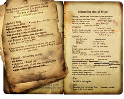
I started with photobashing, and after we had about a month of content in Catalyst Quest, I shared a visual aid with the players for the first time! That's right! The original concept for the journal. Behoooold
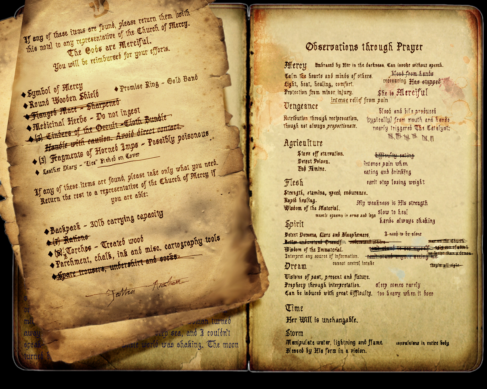
This is so crunchy lol. Quick shout out to my beautiful, wonderful, phenomenal patrons. I put high-res images on Patreon, because itch.io has a miserably small file size limit (3MB!!!). Hence this very squished jpg. If you would like to help support me making the demo, or just share your love for much higher quality assets, stop on by! Better quality images for this whole devlog will be in the post there.
Squished jpg aside, this handout was more than anything my quest players were expecting. The medium is entirely text based, so they were delighted to get this image with a reflection of their choices. I updated this "journal" periodically for them, based on what happened in the narrative, and kept this up as my art skills and desire for a great player experience grew.
July 2020 - First journal revision! Art level up!
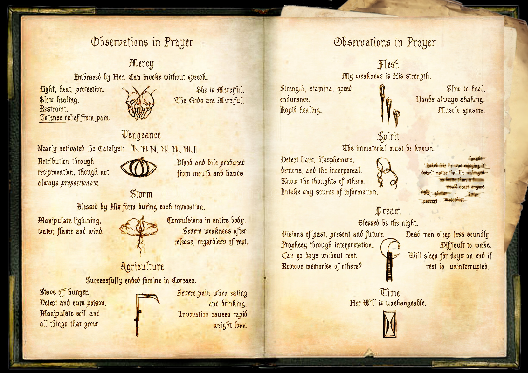
I write at a blistering pace, and the players of Catalyst Quest devoured the lore and abilities they uncovered over the course of the story. We rapidly exceeded the need for two pages to encapsulate the quick reference that would be helpful for them, so I did a revision of the journal, with my first attempts at more accessible graphic design.
The art here is still exceedingly simple, as I only did visuals for Catalyst Quest when I truly thought it would be helpful--maybe one asset a month, at most, without the same regard for quality and consistency as I do for my VN development. Still, you can start to see the same thematic elements emerge here!
April 2021 - The great revision project
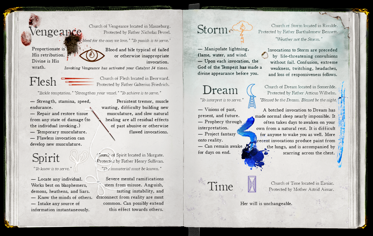
Within less than 2 years, we reached 7 completed books for Catalyst Quest, with well over 1 million collective words of story. I migrated the archive to its permanent home, a forum called Sufficient Velocity, which boasts many quality of life features such as rich text formatting and image hosting. To commemorate this migration and our new home, a pass was done through the entire archive for quality and better formatting.
In the narrative of Catalyst Quest, at the end of a major character arc for our hero, I fittingly described him running out of pages in his old journal. He's given a new one by a close friend, and this object was absolutely treasured by the players, given their long-standing affection for the journal throughout the quest's history. The change in visuals was therefore contextualized in the narrative, as we keep both styles of the journal archived for posterity.
This is so close to the first draft of the journal UI that went into the start of Catalyst: Blind Faith that many of you may recognize it!
April 2022 - Development of Catalyst: Blind Faith begins, omg
I spent many, many months researching a game engine that would best suit my needs for Catalyst: Blind Faith. Given the enormous volume of quality of life features Ren'Py boasts, its thriving and helpful community, and how well suited it was to a brand new programmer (I had never touched code prior to starting this game's development), I was willing to accept the extraordinary amount of work it might take for me to implement the journal menu system.
My approach throughout the demo's creation has been to work in project-based chunks for skill development. I started with the smallest conceivable slice of the prologue to get my feet wet, and have released each big update publicly since then. Only after I spent a solid month familiarizing myself with Ren'Py's basics did I attempt even the simplest implementation of this custom menu system. Rather than rush it, I went one step at a time.
May 2022 - Humble beginnings lol
The bare basics of the journal's functionality includes its navigation using imagebuttons, to display different "pages" to the player. This entire menu system is designed to be optional, which is hilarious because of how much work I put into it, but it is vital to me that the player never feels like they MUST dig through menus to get important lore.
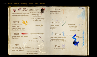
So with its contents wholly being for reference and as a reward for curious players, one of the most helpful pieces of info it provides is a record of how you interact with every deity in the pantheon. These core elements were all present, even in the simplest and earliest design -- using many pieces from the last Catalyst Quest journal concept!
I used this journal layout for the next many months, asking players for feedback whenever possible. Our Discord community was especially amazing with voicing desired degrees of transparency of information and other features!
You may notice there are already 5 tabs here for navigation. The sheer volume of elements in each submenu is a lot to unpack, so we're going to save that for a bit later, after this dissection of the navigation layout and base elements.

August 2022 - The real Dark Souls begins
During months of playtesting and user feedback, on my end I programmed and implemented MANY final features. A color-changing name for the protagonist was added to the game's code as a tip-off to users when their relationship with the deity they most favor has changed, as well as greatly added transparency to relationships within the journal. The page layout was massively expanded, and I cemented the use of picture-like imagebuttons, styled as bookmarks, for flipping to each section.
The next several months were spent testing these placeholders. I utilized simple, flat images wherever possible, so that the more complex code could be thoroughly tested in isolation. Learning how to most efficiently get every element working together, then playtesting all permutations of interactions was something that me, my QA team, and a small army of alpha testers worked on relentlessly! When it was up to my standards of quality (no bugs we could identify, no performance issues, and everything working as intended) I cooked up the next demo release.
September 2022 - Happy Anniversary!
This was the 3rd year anniversary of Catalyst Quest, so to celebrate, I shared my working version of the upcoming demo with a big community Discord event. The improvements in functionality were staggering, and went over very well. The public build was released shortly thereafter!
The placeholder layout from that update is what is still available in the current, public build, though there have been multiple quality-of-life features added since then. As previously mentioned, these flat and simple art assets were placed to help with testing, and are not the final art. It all showcases those core features seamlessly, though!

January 2024 - The BIG Update
An enormous volume of other aspects of the demo were worked on over many months, including art concepts, polished writing, continuity, and the last of the placeholders. This is when the current public build of the game was released, and that version is available on the itch.io page to download at any time! It showcases many of the core functionality features in the journal menu, such as:
CONTACTS and DEMONS:
- Each character you meet is displayed, with descriptions based on your choices and their fate.
MAPS:
- Isometric maps display dynamically, based on areas you explore. Two of those maps are available in the demo!
INVENTORY:
- Each major item you obtain is displayed with an image and quantity.
- The quantity of items obtained or used are persistent and hand-drawn, not shown as a simple number. For example, if you gather 10 torches and then burn through 3, it shows those missing quantities checked off.
- On hover, flavor text is displayed, sometimes providing additional lore or insight into the MC's thoughts on that item or where it was obtained.
NOTES:
- Major events update in the order they are seen, with a summary of those key events for easy reference.
- All notes persist in each playthrough, so even if you time travel, this is a reliable way to see the events you have experienced.
- Players can type their own notes too! The entire right page is a dedicated space for your own thoughts/memes/etc.
DEITIES - The eight left-most tabs correspond to each deity in the pantheon:
- Reference for each deity's name and their holy symbol.
- Reference for each deity's "domains", AKA the parts of reality those deities encompass.
- Boons and banes from using that deity's power, by channeling Them through the MC's body.
- Updated information in all sections, based on information the MC uncovers through hard experimentation or research, based on the player's choices.
- A tracker of how many times you have used the power of each deity.
- On hover, the history our MC has with that deity, as well as his reflections on his current relationship with that deity.
- Additional information based on events experienced with each deity. E.g. if you have a nightmare, our MC interprets that as a visit from "Dream," the God of Nightmares, and will record that nightmare in his journal.
June 2024 - The Final Boss of UI Design
Having had several months of a health concern to rest and reflect (I am doing much better!) on final touches for the demo's art, I set about some concepts for the final art design. This stemmed from feedback from dozens of players since the January build, my own research into accessibility and menu design, and a strong desire to make the final art as consistent and quality as possible.
Naturally, my hand-drawn mockup looks shitty and hilarious.
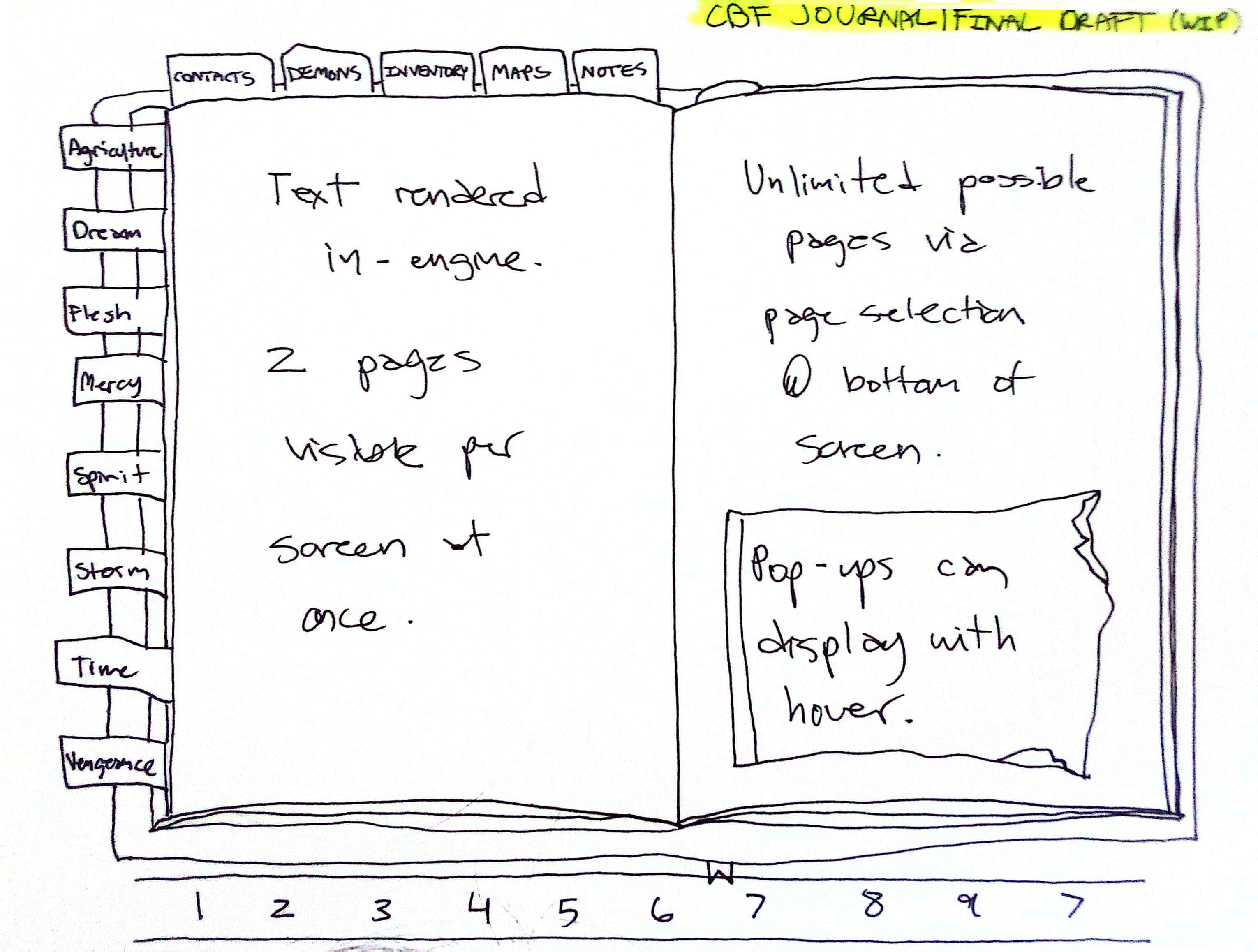
What is important here is the attention to accessibility!
The deity tabs being symbols alone is not friendly for users--text navigation AND images is key for clarity. All tabs are alphabetized for ease of navigation. Bottom navigation for the various pages that can be added to each section has been needed, so I accounted for that space.
The image is pretty simple, but with a lot of work on positioning elements, testing for font size, and mockups ran by my QA team and community, I created the final art assets!
July 2024
literally me last night
Just look at it
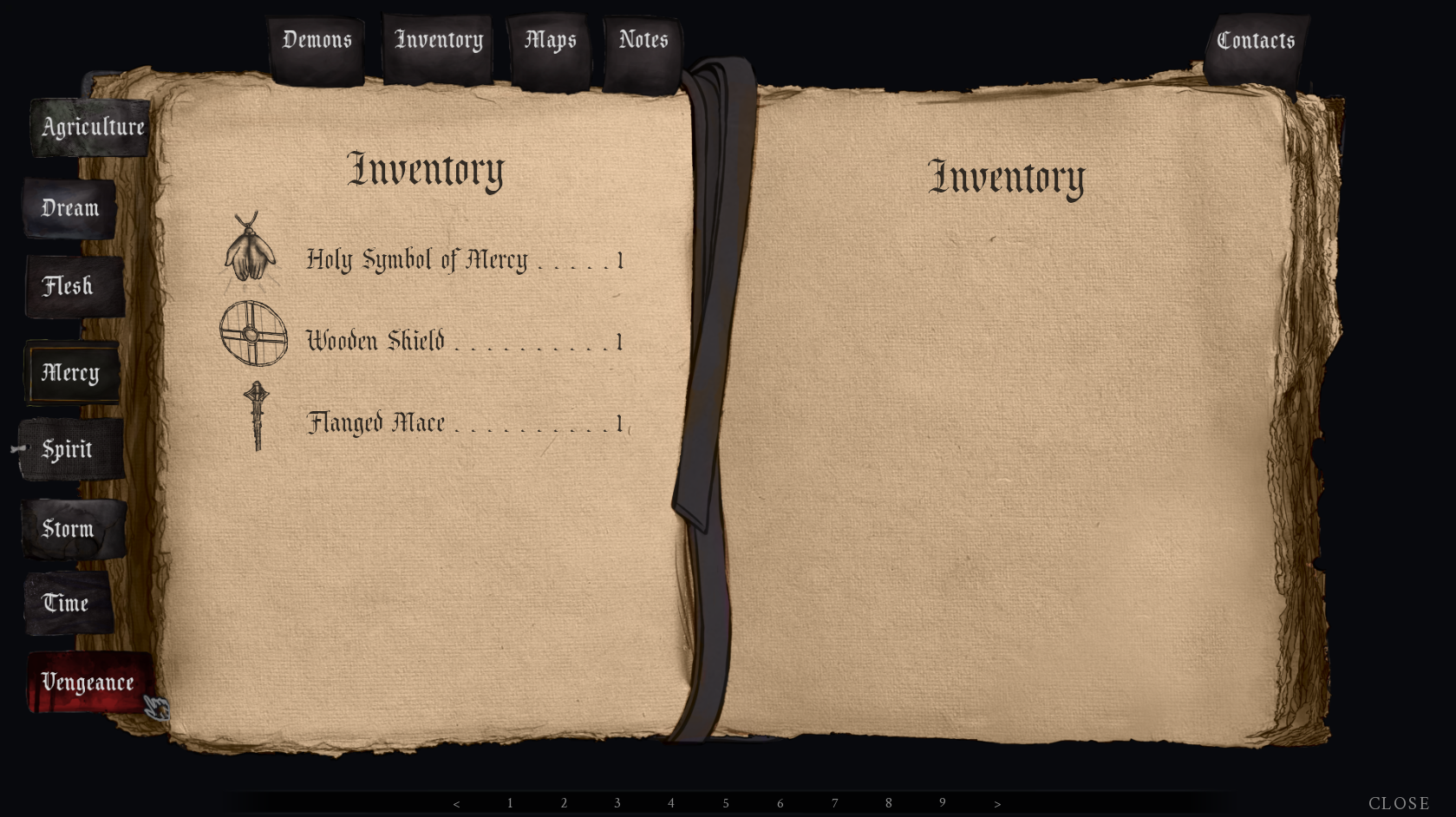
Pretty nice, right?
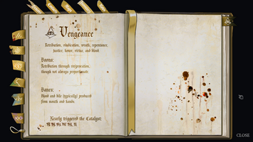
This is the final art!!!!!! For the pages, bookmarks, and navigation elements. As you can see, everything is at last in place with the complete UI!
The content on the pages is a mockup (where it says "Inventory" with each item) so I could share the art with you all today. I am in the process of programming the page contents, which is simply rendered in text in-engine in most cases. This is going to remove dozens of placeholder art pieces from the game, so despite the upcoming demo having drastically higher quality art, it might actually be a smaller file size lol.
There are NUMEROUS changes I made under the hood to improve the code of this menu since its earliest versions, along with multiple sweet new features I cannot WAIT to share. Just to name a few:
- The journal pages now remember where you left off. You were looking at the Notes last? When you open the Journal again, you're right back on the Notes tab.
- The scrollbars also remember where you left off! Reading your lovingly hand-written notes about what choice you want to make when you run into the orc warchief and his crazed centipede demon? That spot you are scrolled down to in the journal will be right there when the menu is opened again.
- Gamepad users will have a cute pin that sticks to where they are hovered, so they can easily see where they are navigating within the journal contents -- such as items you want to look more closely at in the Inventory.
- Bottom navigation to quickly jump to deeper pages within each submenu.
- Bitchin' final art.
UPDATE COMING SOON - I am terminally excited about my project, many ways to get more info beloooow
You made it! Thank you for reading all of this, and I hope it was insightful (or at least entertaining)!
I am positively vibrating with excitement over the art progress being made. The next update will have a LOT of things to share, and this devlog is already way too long as it is.
While researching these old assets and chronology of events, the best tool in my toolkit was hilariously my community Discord, since I share updates there so often. While I'm cranking out assets for the next update, feel free to join us there! We're friendly and meme. A lot. There's also game dev streams and stuff.
Also enormous thanks again to my patrons on Patreon and Ko-Fi, who have been so kind and supportive. The Patreon is where I share first looks at final art, high res downloads of devlog content, and a lot more! Feel free to come check it out!
You're welcome to try the early development demo on the game's itch.io page, which has a functional version of the journal. As you can see, the quality of the final release is something I'm working very hard on, but getting your hands on the placeholder menu functionality can be very helpful to better get a feel for your own menu design! Or just for fun. There's also a whole game attached to this, so :^) hope you enjoy!
Thank you so much again for your time. Looking forward to sharing much more content soon!
Get Catalyst: Blind Faith
Catalyst: Blind Faith
Conquer your demons, inside and out.
| Status | In development |
| Author | Just Write Studios |
| Genre | Visual Novel, Action, Adventure |
| Tags | Dark Fantasy, Horror, Indie, Male protagonist, Monsters, Narrative, Singleplayer, Story Rich |
More posts
- DEVLOG - THE DARK SOULS OF WRITING: Character Writing in a Branching Game🔥5 days ago
- DEVLOG - Quality Writing Techniques (My Beloved)34 days ago
- DEVLOG - Timey Wimey Game Design (Yes it is complicated)68 days ago
- DEVLOG - July Art, Artfight, and Excellent News from the DevJul 25, 2025
- DEVLOG - Punishing Game Design (VENGEANCE)May 09, 2025
- DEVLOG - Merciful Game Design - The "Trunk" of Catalyst: Blind Faith's Branching...Apr 08, 2025
- DEVLOG - Common Route Mechanical Madness + All Routes PreviewMar 10, 2025
- DEVLOG - 2025 Roadmap!Feb 09, 2025
- DEVLOG - 2024 Celebration and Recap!Dec 30, 2024
- DEVLOG - Narrative Design and the Branching Structure of Catalyst: Blind Faith!Dec 06, 2024
Comments
Log in with itch.io to leave a comment.
We are SO back.